


5to9
SaaS Marketplace
Role:
Product Designer (UX | UI)
Team:
Founder, 3 Designers, 6 Engineers
Timeline:
Jan 2024 - Present
overview
Background
5to9 is a SaaS marketplace that facilitates event booking between customers and vendors. Clear communication of what a venue can offer is an imperative, so vendors know what to prepare, and customers know what they can expect. The MVP has been designed, built, and in beta.
USERS

Customers
Users for this case study
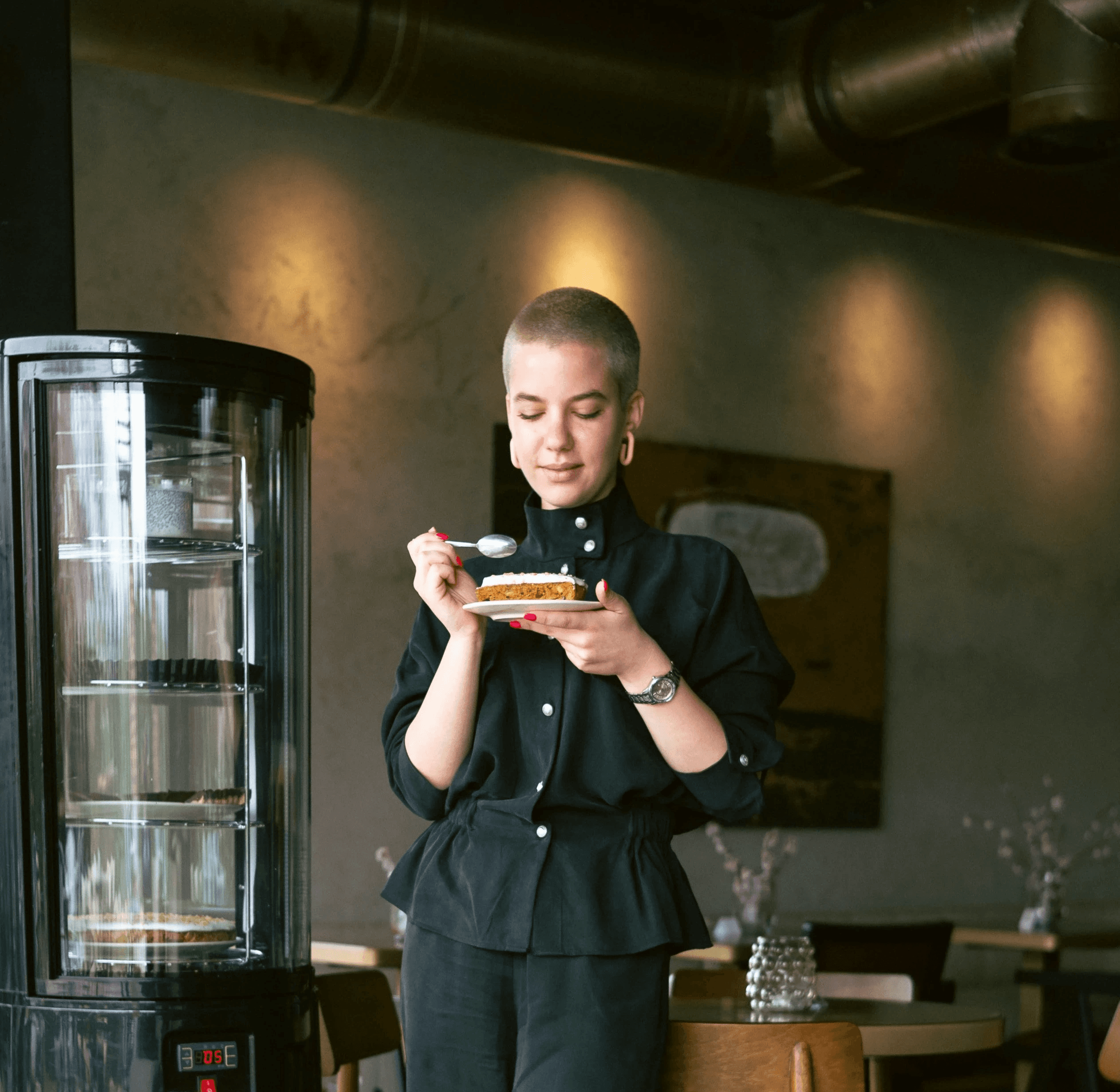
Vendors
My role
End-to-end design of the vendor event package and pricing flows. Close collaboration with the cross-functional team to ensure alignment in solutions across our platform and user groups.
PROBLEM FOR VENDORS
Restaurant Managers & Owners have empty spaces that could generate income, but do not know how to publicize their venues
When cold contacted for events, significant time is required to explain all the offering options on leads that may not come through
5to9 Business Goals
Determine the event package and pricing model that would provide value to businesses and suit a wide range of venues and vendors
Reduce user friction to encourage adoption of a new process for busy vendors who are not tech savvy and have established routines
solution
Vendors can create event packages for their spaces that detail the offerings included under a fixed price, so customers are able to see, compare and book events on their own. It saves vendors time and focuses their efforts on reliable leads and bookings.
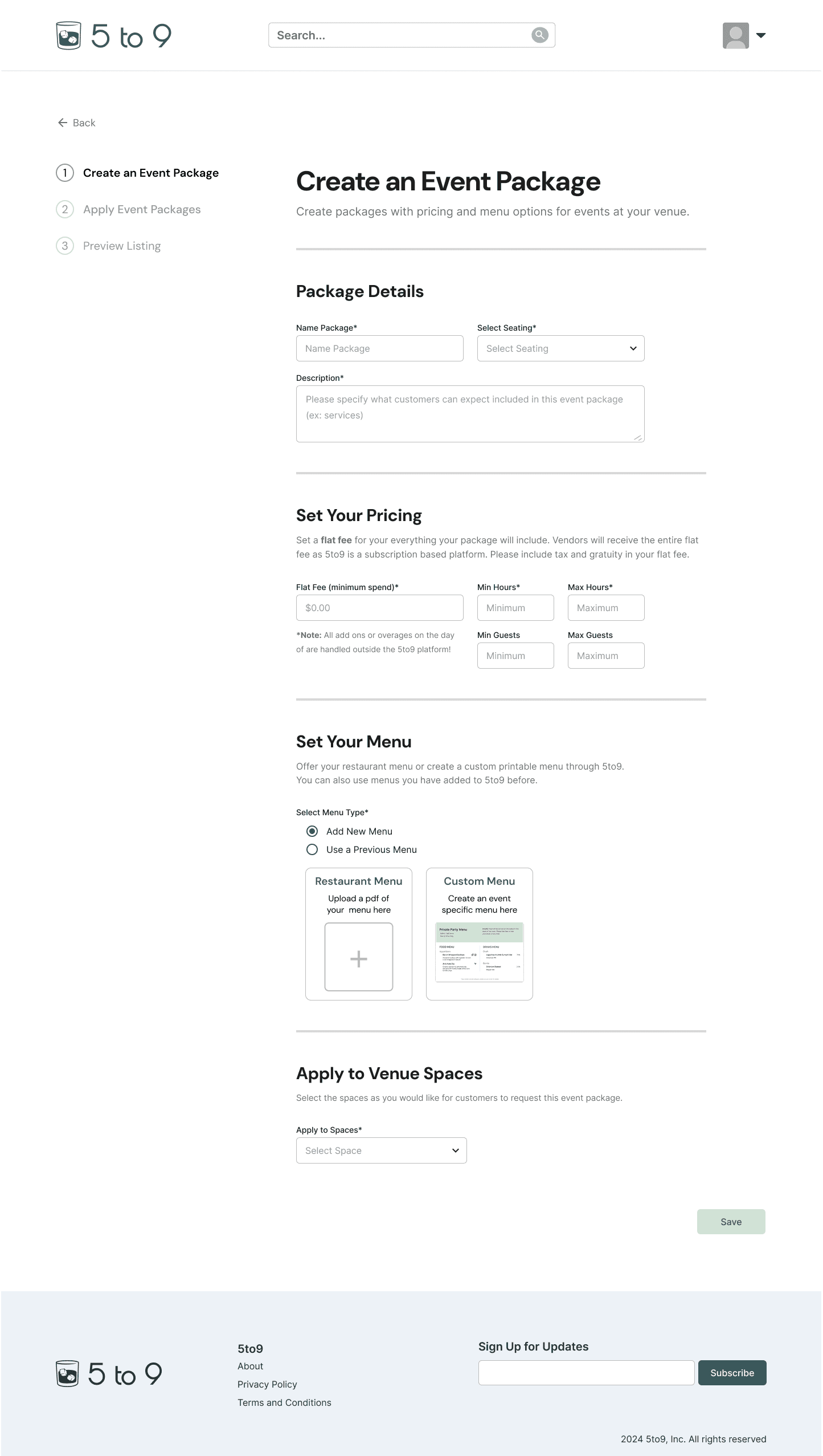
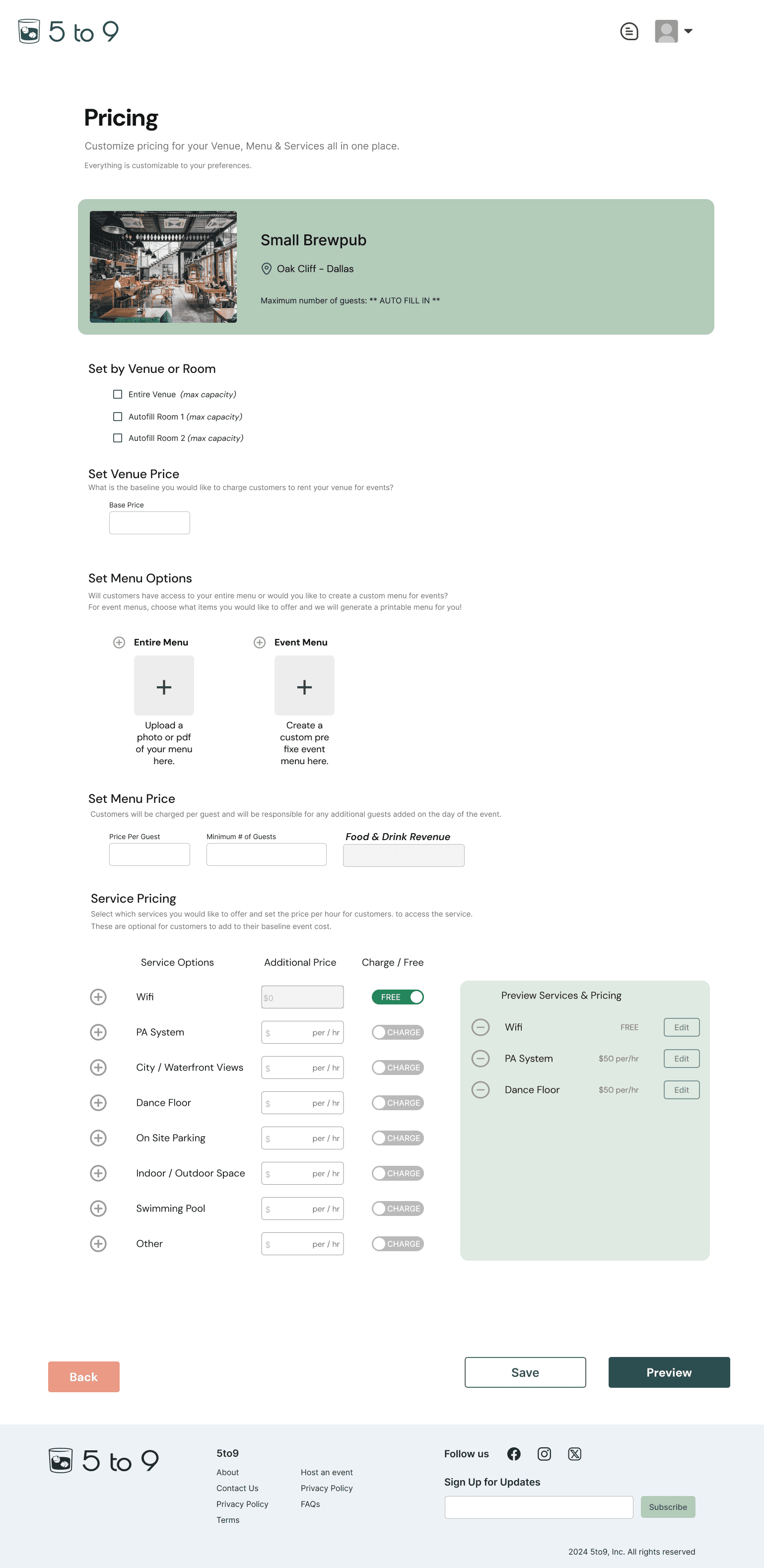
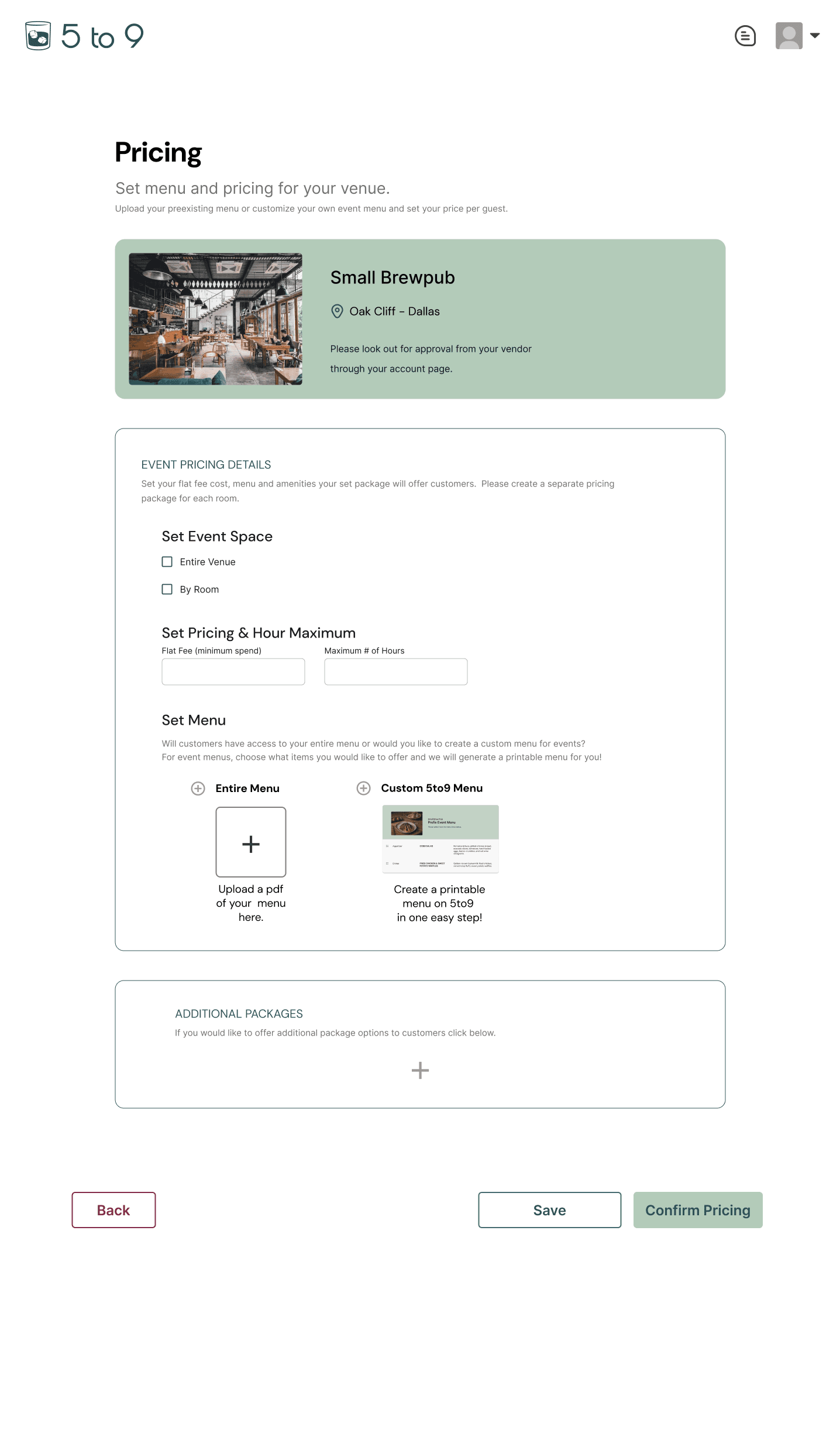
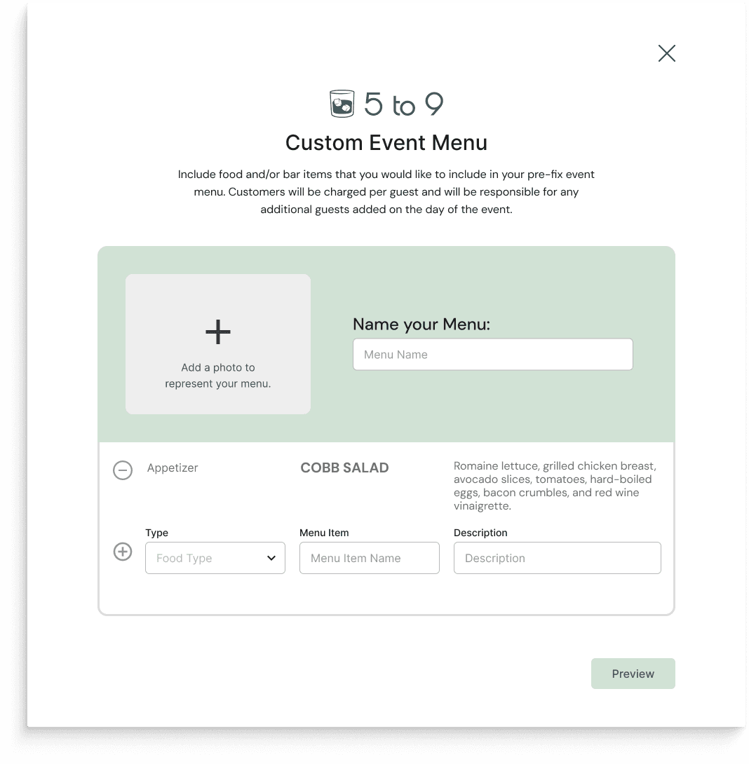
Create an Event Package

Create Custom
Menu Modal

Preview Custom
Menu Modal

See & Modify All Event Packages
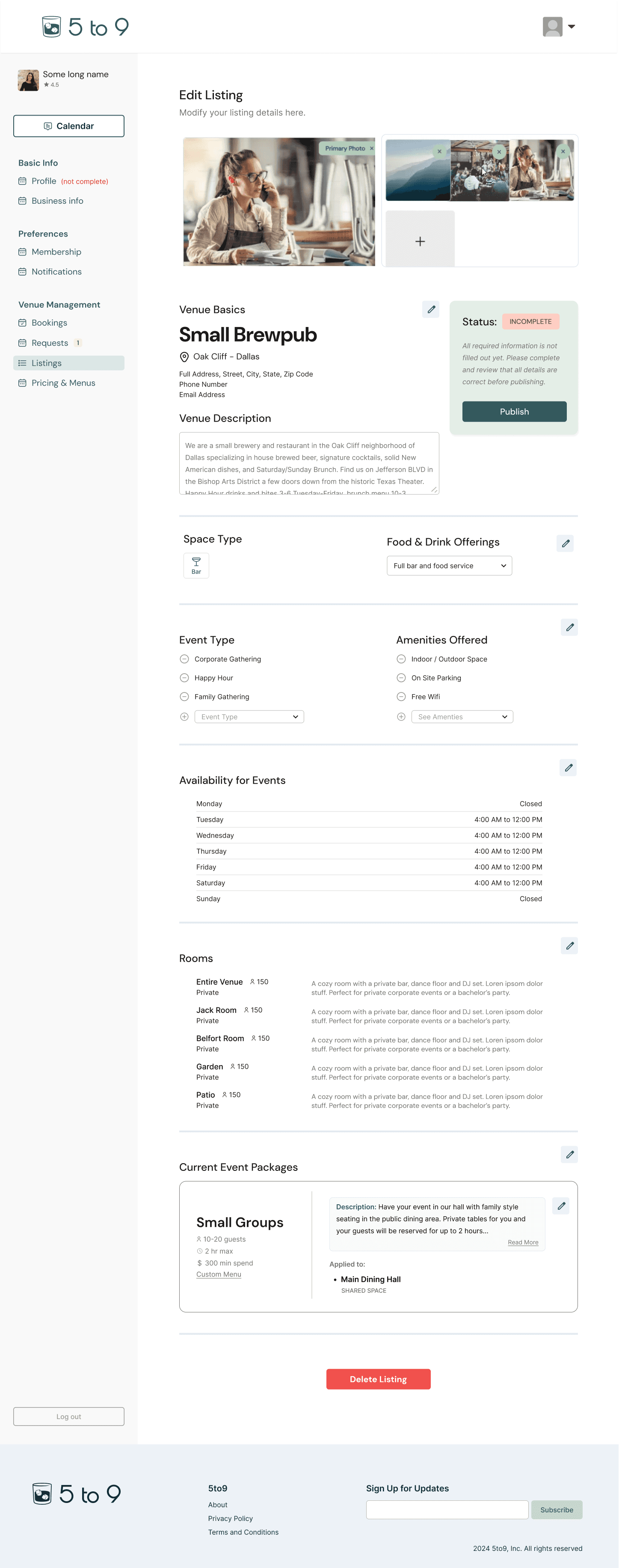
Edit Listing
outcomes
Impact
Business
Defined the event package and pricing model between vendors and customers
User
Simple flows and interfaces for the input & management of complex event details
Team
Established a design system to promote cross-functional consistency and efficiency
Success metrics to measure during beta testing
User Activity
Track the percentage of active users, to understand adoption rates and obstacles that may arise over time.
Task Completion
Track completion rates of each user group, to assess if they are able to complete their goals within context.
User Satisfaction
Conduct user satisfaction tests and gather feedback to understand if there are areas that require improvement.
existing design
When I joined the team, there was an existing hypothesis for Event Packages: a fixed bronze, silver, gold system

Tiered Package MOdel
Intended to allow customers to quickly and more objectively compare different venues. However, it forced vendors to fit their offerings into restrictive packages
This system was great for customers, but not great for vendors!
Why not? Data from initial research showed that each venue has vastly different ranges of what they could and wanted to offer
user research
However, it was not validated. I asked, would this model work for vendors? Answer: No
User Advocacy, Ideation & Testing
I successfully advocated for further ideation, testing and validation with vendors before proceeding with the existing solution
I went back to the interviews to ideate additional solutions based on data and convinced the business team to meet with the vendors again
Below are the screens that were tested with the target audience
Tiered Package Model
Price: By Hour
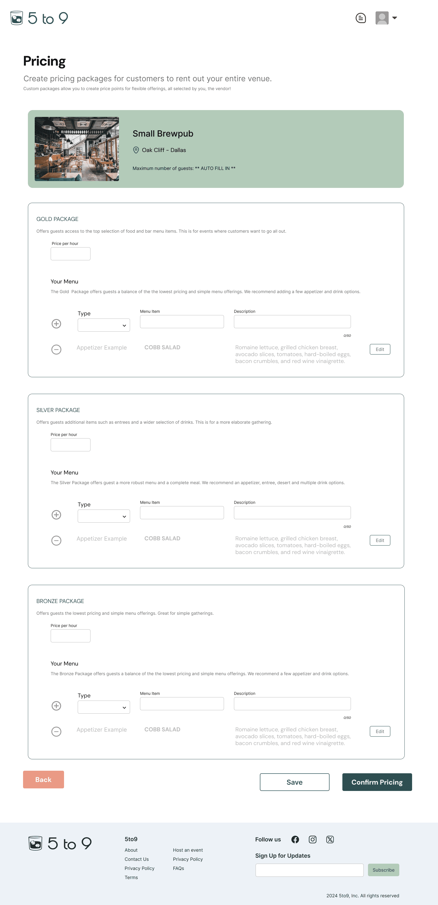
Add On Model
Price: Per Person
Minimum Spend Model
Price: Set by Venue

Insights:
The fixed price model was desired by vendors due to its simplicity and flexibility because every venue handles pricing differently!
design process
highlights
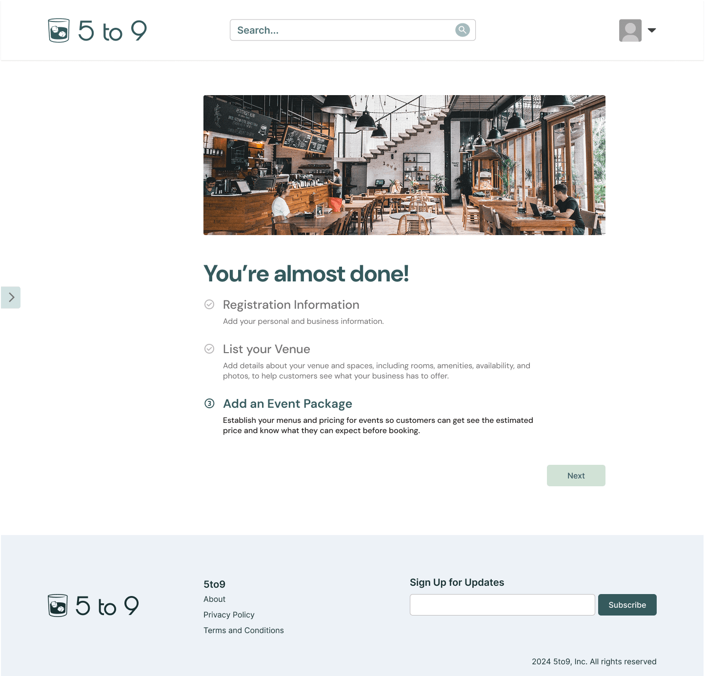
Once the validated event package was added, the overall vendor onboarding flow became too long and complex, which could cause user confusion, fatigue and drop off
Onboarding Steps
Create an Account
Register
Create a Listing
Create an Event Package
Each step was a multi-page process & required several different inputs per page
SOLUTION
Reduced the user flow to include only the most essential steps to increase comprehension and to prevent cognitive overload and user drop off
V1

V2

Approach
Converted screens back into black/white mid-fi frames to help concentrate only on clarity, usability and understanding
Unified terminology and copy across processes
Test ran the prototype with the cross functional team and worked together to identify what was key and what could be completed at a later time
The next challenge was figuring out the most appropriate way to guide and update users on their progress during vendor onboarding
V1

This stepper worked well on it’s own, however, it simply created additional visual information to process when added to all the screens
It became extra confusing in combination with the existing stepper for the “Create a Listing” flow
SOLUTION
Designed and advocated for an overview page that sets the context for new users on what to expect, updates them on their progress, and providers a refresher for the next step
V2


WHY
Keeps the overall onboarding flow and the individual task flows visually and conceptually distinct
If users do leave and comeback, they would be directed to the page for the step they left off on, reminding them of what they were working on and how much is left
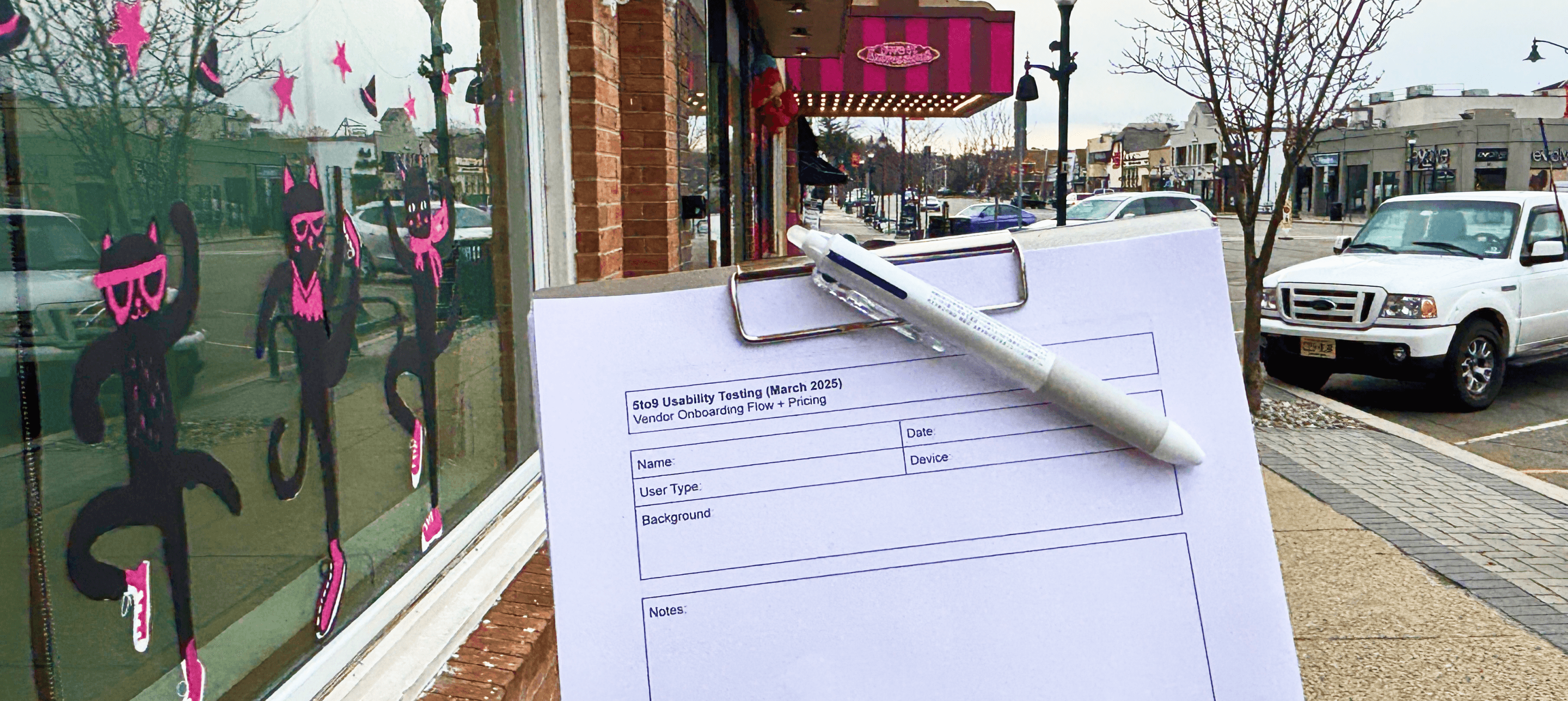
The last hurdle was getting in touch with extremely busy restaurant owners and managers… Solution: I decided to go out in person see if anyone had time to talk. Success!
USABILITY TESTING
5 Restaurant Owners & Managers
*Fun Fact: I conducted usability testing with 5 restaurant industry professionals when I had trouble contacting vendors, but I found that there were still many unanswered questions and that I really needed to talk to my target audience
Key Insights
Vendor onboarding flow was clear and the length appropriate
Vendors understood and validated the event package and pricing structure
Vendors need to indicate information on food allergens and intolerances
Vendors need to know in advance what services and set up would be required
iteration
The event packages and menus needed more information to ensure that vendors and customers were aligned in their expectations!
Event package iteration
Vendors need to factor in set up and services to account for staffing as well as the total amount of hours to calculate their minimum spend
SOLUTION
Additional inputs allowed vendors to specify the necessary information. Enabling them to set, calculate, and include them in their pricing.

Set Up: Multiselect for types of seating
Services: Enables vendors to specify any details that are venue specific
Min / Max Guests: Vendors need at least a certain number of guests for it to be worth closing off regular dine in areas, however, they also want to keep space free for their regulars / walk in customers
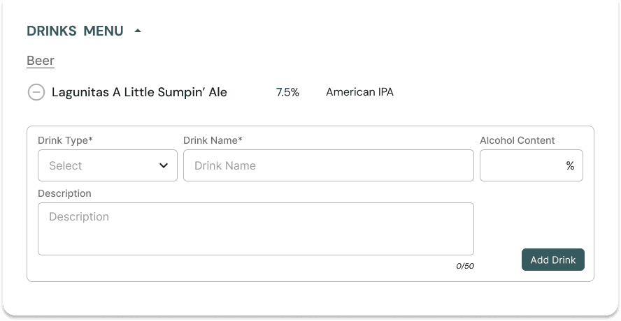
Menu Iteration (1)
All participants mentioned that the menus need to include food intolerances and allergens
SOLUTION
Removed the photo as it was not necessary and included additional inputs that vendors needed as well as an area for additional details


After
Before
Inputs for food and drink services allows vendors, customers, and guests all understand what to expect
The addition of a food allergens & intolerances input made the original design too cramped. Made it two rows to allow users to add as much info as needed
Separate drinks menu. Food and drinks are often handled separately by vendors
Menu Iteration (2)
As the menu needed to hold more information, the event preview needed to be reformatted so it would not become too long
SOLUTION
Looked up conventional restaurant menu designs to see industry approaches for organizing menu information and adopted common patterns
Before

After
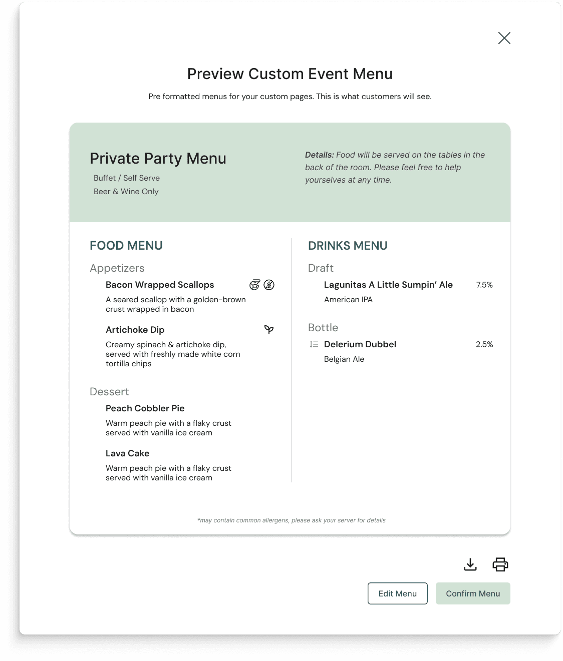
Why:
Two column designs were a common pattern that most people are familiar with and could incorporate much more info
Photos were removed as they were an unnecessary and additional load for the developers for the MVP
outcomes
A deeply collaborative process between the design, business and engineering team resulted in a unified vision, smooth hand off and user-centered designs.
Business
Defined the event package and pricing model between vendors and customers
User
Simple flows and interfaces for the input & management of complex event details
Team
Established a design system to promote cross-functional consistency and efficiency
Seamless Handoff
Creating and maintaining a design system promoted consistency and efficiency for designers and engineers
Includes tokens, variables, colors, text, spacing, grid, and reusable components
Developed a detailed guide for colors and use cases within the design system
Provided annotated examples and prototypes for interactive states


Final Designs
Pages I was responsible for designing end-to-end for the event packages and onboarding
Success metrics to measure during beta testing:
Task Success
80%+ average task success rate for each task
Perceived Ease (SEQ)
80%+ average of perceived ease (SEQ) for each task
Information clarity
Fewer than 20% of participants report missing information or confusion
reflection
Main Takeaways
How to advocate for user research & testing
The true importance of lo-fi wireframes to focus solely on usability, conceptual understanding, and consistency. It’s even a good thing to go “backwards” when necessary!
When I am struggling to make contact with users, to go out into the real world. Meeting people in person helps understand their context as well.
Next Steps
Get feedback post MVP launch from vendors, conduct research and iterate on designs
Create further pricing and event package models based on vendor needs
Continue collaboration with the customer facing product designer to ensure that customers are getting the information they need from vendors to feel confident in booking events through the platform


