
SnoutScout
Dog Profile Enhancements
UX / UI
Onboarding
Role:
Product Designer
Team:
Founder & Product Manager, Engineer
Timeline:
8 weeks, Jan - Feb 2025
Tools:
Figma, Miro
Overview
background
SnoutScout is an existing app for dog lovers to build community and foster real world, positive interactions around the love of dogs!
When joining the team, the app was still in the phase of determining what features and functionality dog lovers want and need.
I was tasked with figuring out what pain points dog lovers may encounter and learn how SnoutScout could help.
User Problem
Want to see and share important information about the dogs before interacting with them
Business Goal
To promote positive and safe in person and dog interactions
Solution
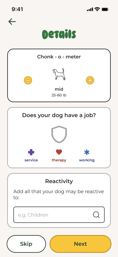
Dog Profile Enhancement
A “Details Screen” was added to the existing dog profile flow to incorporate size, dog job and reactivity information in a fun and engaging way. The dog profile was also updated to reflect the additional information.


Impact
+18%
Desirability Rating
from initial ratings prior to the profile enhancements.
People commented on how much they loved the humor and playfulness throughout the entire experience of setting up a dog profile
What would people want and need to see on a profile for a dog?
Research
Most Important Factors for Users:

How might we make inputing information a fun experience?
My Approach
Inputting a lot of information is rarely fun...
My approach was to design unique interactions and inject notes of silliness and joy, through copy, color and iconography.
As a lot of the UI already existed, I also considered how I could style the inputs to be on brand!
By designing unique experiences with elements of humor & joy!
Design Goal
The existing design already included breed, temperament and play style. My goal was to add size and reactivity in such a way that did not disrupt the current flow, make it too long and infuse it with joy!
WireframeS
I used wireframes to brainstorm how I could integrate the additional inputs without making the overall onboarding experience too long or cumbersome.


Lo-Fi Wireframes
I explored different and engaging ways users could input the information.

Mid-Fi Wireframe
A mix of initial ideas! Selected based on how each interaction could be unique from one another

Hi-Fi Mockup
The final idea was a checklist that would allows users to select broad categories or expand for detailed options
Initial DesignS & Iteration
My initial instincts were to design each interaction to be fun by adding visuals. I realized however, that the user experiences were actually pretty similar
So I challenged myself to try to make each interaction unique!
The final steps before usability testing were presenting the designs to the team, iterating based on feedback, and prototyping.
Context: Many dogs are reactive based on the size of the other dog and their size is not always apparent from photos. Users needed to see information on dog size.
Solution: Added dog size in a fun, engaging and on brand way

*participants were in giggles reading through the dog sizes during usability testing*
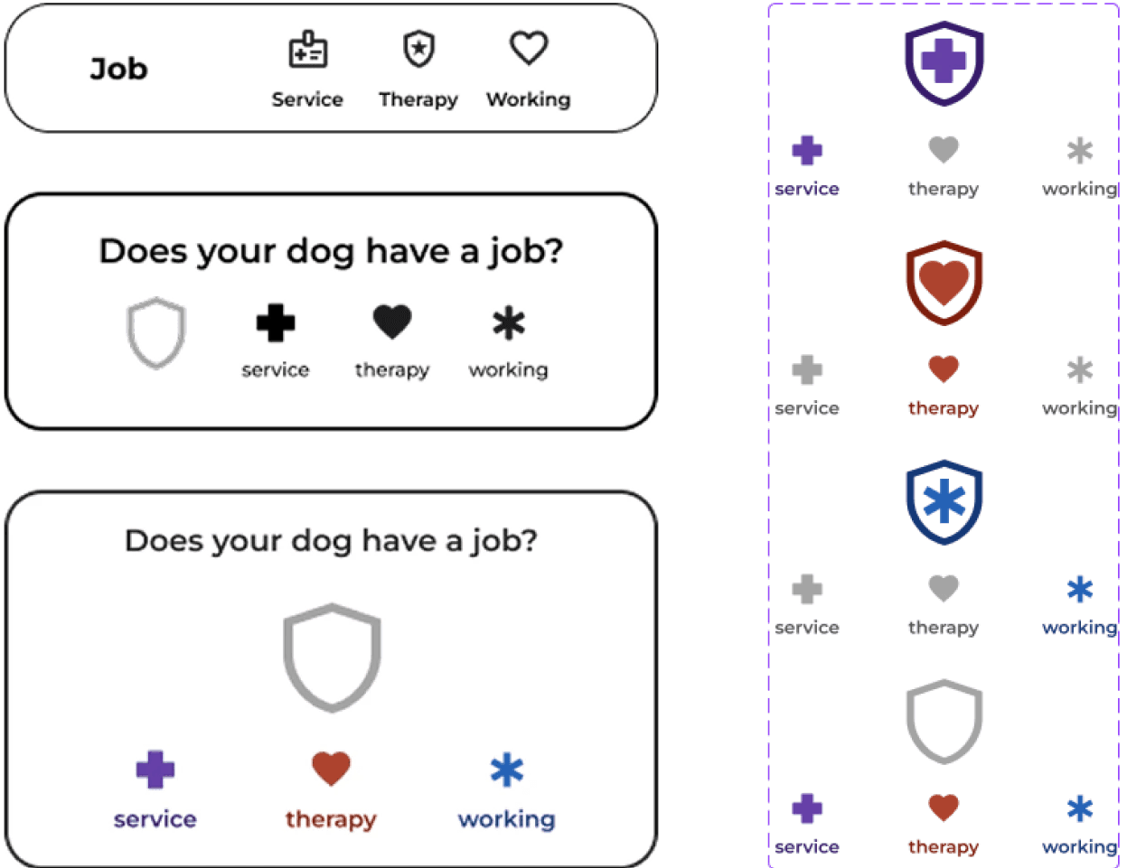
Context: It is important for people to share and know when a dog has a job such as a service animal, to encourage respectful and appropriate interactions.
Solution: Added jobs into the dog profile flow in a format that commands attention and respect but is equally joyful and interactive.
Context: There was an existing design for “stats” but the included categories were not yet validated as what users wanted.
Solution: Included the elements of temperament (aka dog personality) that users were interested in knowing from interviews and made it quantifiable.
BEFORE

Existing UI allowed people to drag bars to random increments and included many different categories.
AFTER
Changed drag bars into quantifiable dots
Narrowed down categories to the personality traits that users wanted
Context: The team thought the “reactivity swipe” concept was fun, but that might also be unclear and / or cumbersome for users.
Solution: Updated reactivity to be a checklist that enabled both general as well as specific inputs.
V1 (Swipe)
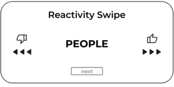

V2 (Checklist)

The new additions and updates surpassed our usability testing success metrics, but also highlighted an opportunity for improvement (reactivity).
Usability Testing
5 Reactive dog owners
Interactive hi- prototype
Tested: Dog profile flow
Key Insights:
Dog profile inputs were organized and logical
Loved the size input interaction
Thought it was great that reactivity was included...
But the reactivity input section could be improved
Iteration
Problem: “I already know what my dog is reactive to... but I feel like I have to dig through this checklist, and it’s pretty long.”
Solution: A reactivity multi select search that enables users to find their specific inputs more directly and create custom inputs if they are not available.
V3 (Search State)

Direct search
Create new tags
Results that update as users type
V3 (Selection State)

Fun, easy to scan and modify tags
IMPACT:
These tags make the experience feel positive and are easy to add, edit & visually scan
A great set up for future feature additions
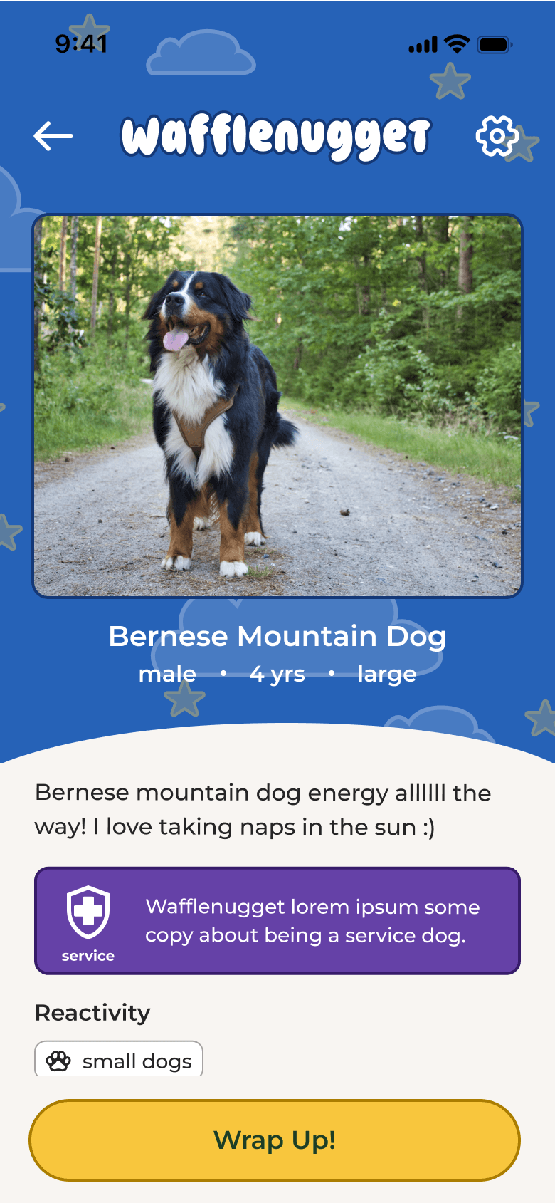
Outcomes: Adding the profile enhancements helped all user groups access the information they wanted to know & share
New User Flow
The profile enhancement designs helps dog owners include the specific information they want to share about their dog
The final dog profile shows the information owners with reactive dogs and non dog owners want to know in a concise and fun way
Basic Information

Details
added screen
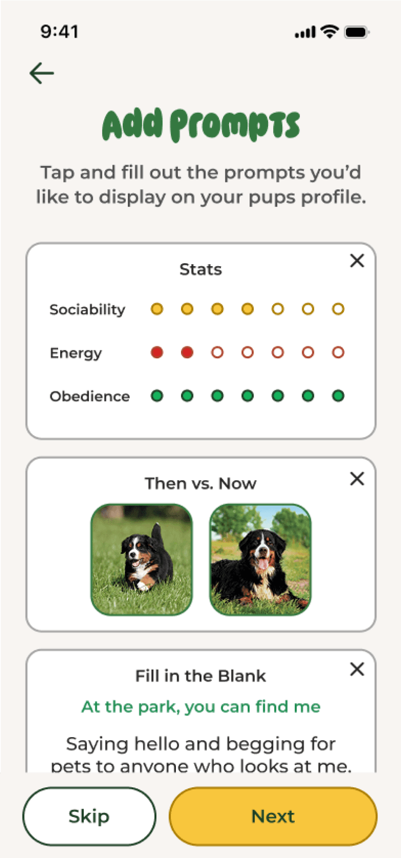
Add Prompts
edited screen
Add Bio
Final Dog Profile
edited screen
Dog Profile Prototype
Tested the full profile to understand:
Was the length and order of inputs appropriate?
Was there continuity between the inputs & outputs?
Did it make them want to use the app?
Try Prototype!
Impact
+18%
Desirability Rating
from initial ratings prior to the profile enhancements
People commented on how much they loved the humor and playfulness throughout the entire experience of setting up a dog profile
Reflection
Main Takeaways:
How to create fun and joyful experiences
How to center the emotions of users in my designs
How to balance patterns and conventions with opportunities for creative innovation
Next steps:
Continued iteration if necessary based on post launch feedback
Use the data and tags from dog profiles to build out new features
Continue further research into owners of dogs with jobs and non dog owners