
Pack Mentality
Website Redesign
Research
UX / UI
Responsive
Onboarding
Role:
Sole Product Designer
Timeline:
4 weeks, Nov 2024
Tools:
Figma, Wix, Wix Analytics, Miro
Overview
background
Pack Mentality, LLC is a local dog daycare and overnight boarding business that needed their responsive website updated.
User Problem
The existing website was visually disorganized
It was difficult for potential clients to find the information they needed to decide if they wanted to try out the daycare
Business Problem
Frequent calls and emails to clarify information took up a significant amount of time and energy
Potential loss of clientele due to lack of trust built through the website
Technical Constraints
The WIX platform had set limitations on how services could be booked and purchased. Services and products were bound to distinct pages, restricted to a list format and were modifiable, to a very limited degree.
Solution
Introduced new content, visual hierarchy, and information architecture to help build trust and enable users to quickly scan and locate the information they need to decide if they want to try out the daycare.
*See a sample of the redesigns below!*
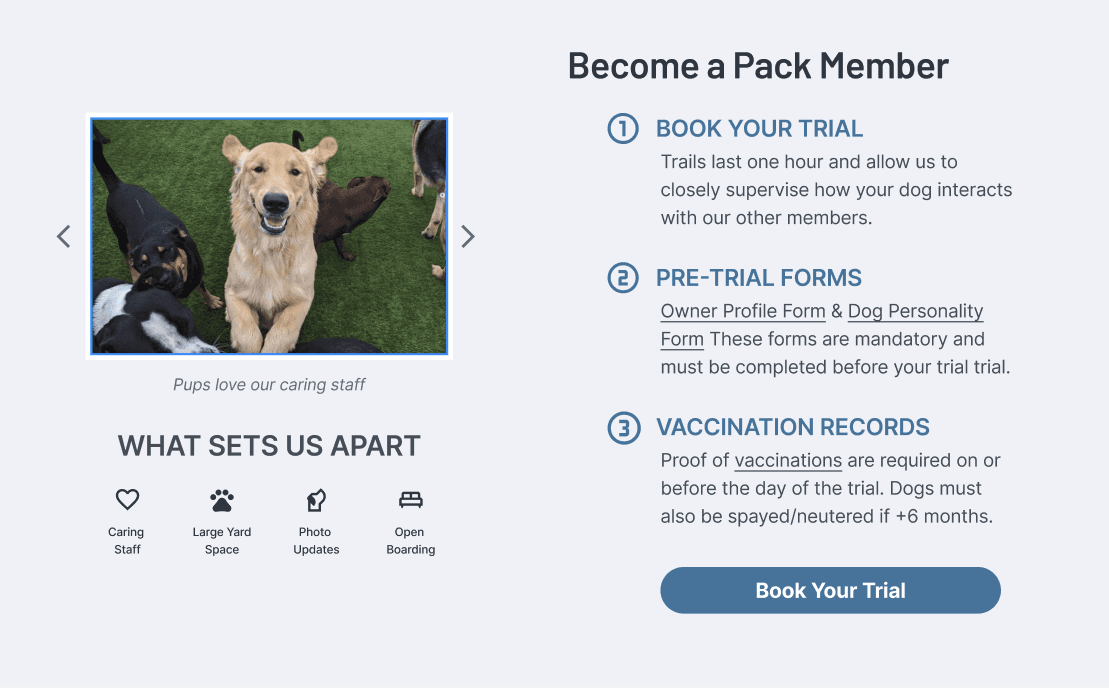
Homepage
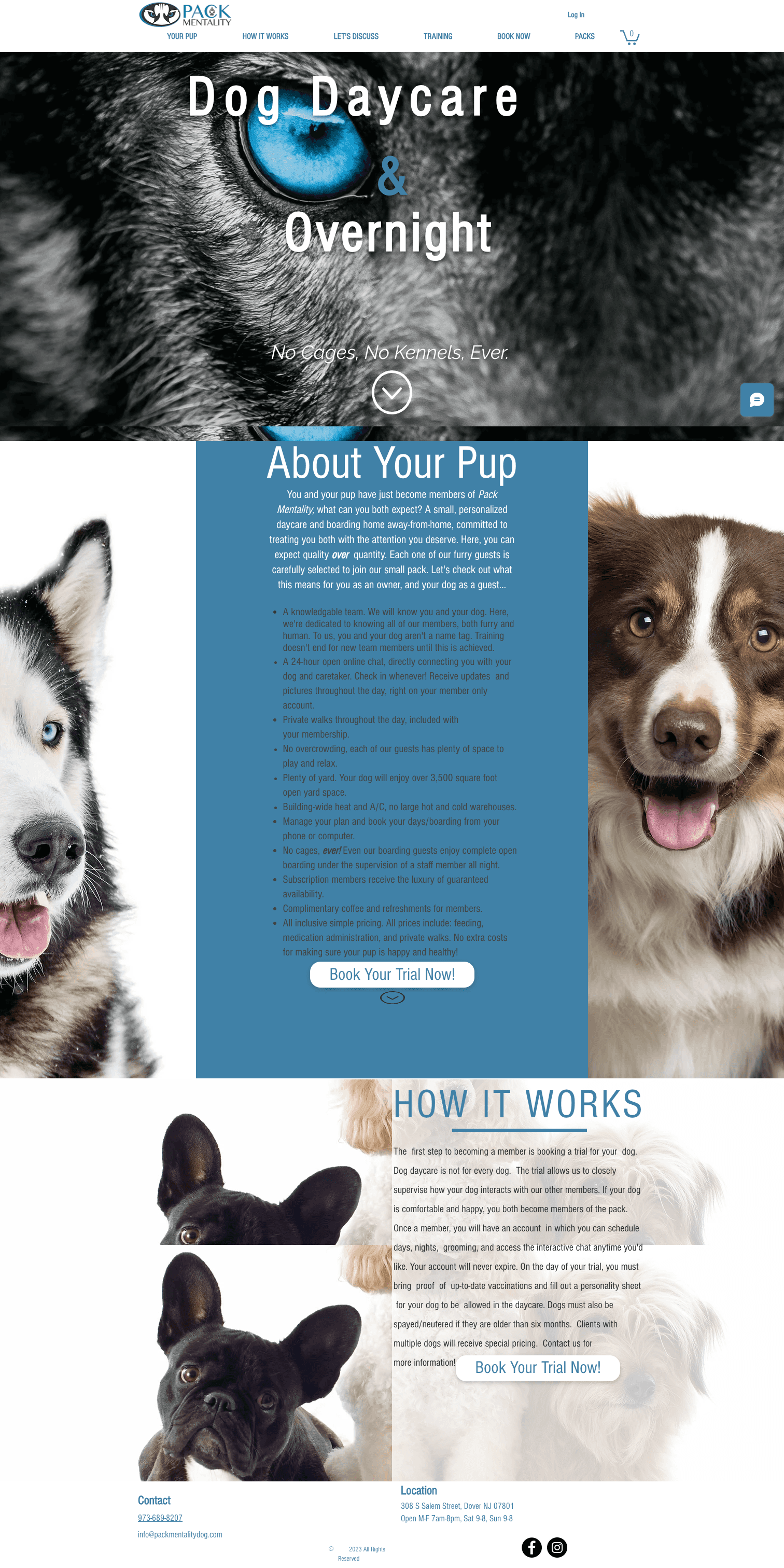
Before
Overwhelming text
Non accessible constrast
Distracting imagery
Confusing copy for titles and menu
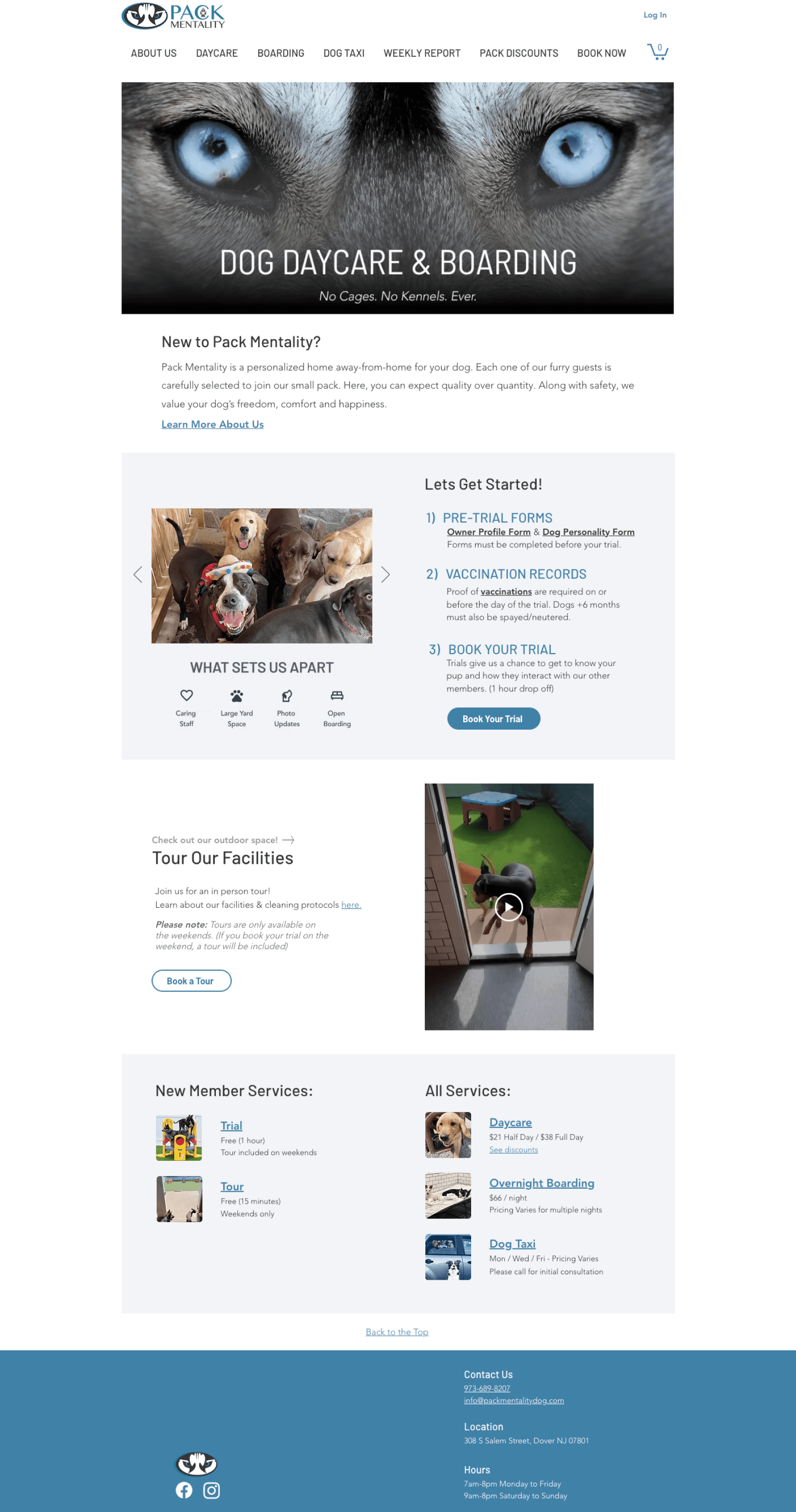
After
Visualized information for easy scanning
Introducing hierarchy and legibility to improve focus, discovery & navigation
Clear & concise copy
Post Launch Impact (1 month)
+57%
New customers
7 in the month prior to the redesign, 16 in the month following.
+13%
Site traffic, New visitors
& Order conversion
Indicates new visitors are converting to customers!
-11%
Offline sales (a good thing!)
The overall number of sales remained the same = booked online rather than through the business owner.
The owner's hypothesis was that potential customers were the main users of his dog daycare website... and my research showed he was right!
Website Audit
Data indicated that the majority of users were potential customers, primarily looking at the homepage on their phones.
73%
New Visitors
69%
Mobile Visitors
53%
Drop off after Homepage
BEFORE

AFTER

Interviews
“A daycare’s website helps me trust if they’re responsible and know what they’re doing”

Potential Clients Want to See:
Genuine care for the dogs
Photos
Services + Pricing
Environment
Facilities
Enrichment Activities
How might we build the trust needed for potential clients to try out the daycare?
My strategy was to organize information and highlight business values to help potential clients find the information they need, while also reflecting the business' level of professionalism & care.
Competitive Analysis
I researched nearby dog daycares and found a few common patterns:
Lots of photos of the dogs and facilities
Services clearly featured on the homepage
Separate pages for each service
Photos and information about the staff (proposed for redesign, but not approved)


Initial Planning

Lo-fi Desktop Wireframes

Lo-fi Mobile Wireframes
Constraints:
Ideally, I would have preferred to work mobile first because that was the predominant format for users.
However, the way WIX works, the mobile version is linked and auto generated based off the desktop inputs.
Approach:
Designed the mobile and desktop formats in tandem to make sure they would not only be responsive, but also work stand alone
Rewrote copy to be clear, concise and well formatted for the mobile version first, which improved the ability to read and scan on the desktop as well
Explored SolutionS
Context: Lack of visual balance between elements was making it hard to focus on the important information users needed to know.
Solution: Adjusted the overall proportions as well as what was visible above the fold, making it clear for users what was on each page.

Dictated by WIX
Constraint:
The WIX platform had limited flexibility for how services and products could be formatted
Approach:
The WIX platform had limited flexibility for how services and products could be formatted
Explored SolutionS
Context: The homepage was a wall of text that explained everything for potential customers but was overwhelming and disorganized, making it hard to read, understand and trust.
Solution: Included only the most important information and created clear sections for users to quickly scan and locate the information relevant to them.

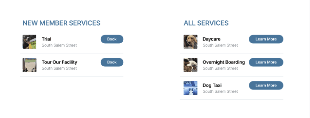


Values & differentiators
Photos from their instagram that show rather than tell users what they want to know
Guided steps for easy onboarding
List of services
Transparent pricing
Video showcasing the facilities as a clean & safe environment
NEXT
Did it work? People loved the changes but missed some key content and were getting confused during the onboarding process.
Usability Testing
3 potential clients (dog owners who are interested in daycare)
2 current clients
Tested redesigns on the live website
Key Insights
Liked the guided steps to help new clients get started
Loved the photos + videos!
Did not see some key information and functionality
Multistep processes were leading to confusion and drop off
Iterations
Problem:
Starting with the primary action led to drop off
Navigating to a different page for step 3 led to confusion

Solutions: Organized steps to encourage task completion and aligned them across pages to maintain continuity.
Numbered and mirrored steps to make it clear that they are the same task
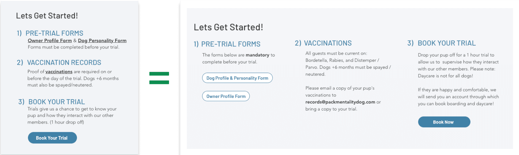
Why:
Helps them to keep track of what step they are on
Enables them to continue without returning to the home page.
NEXT
Outcomes: Website analytics indicated new visitors were converting to customers and booking online!
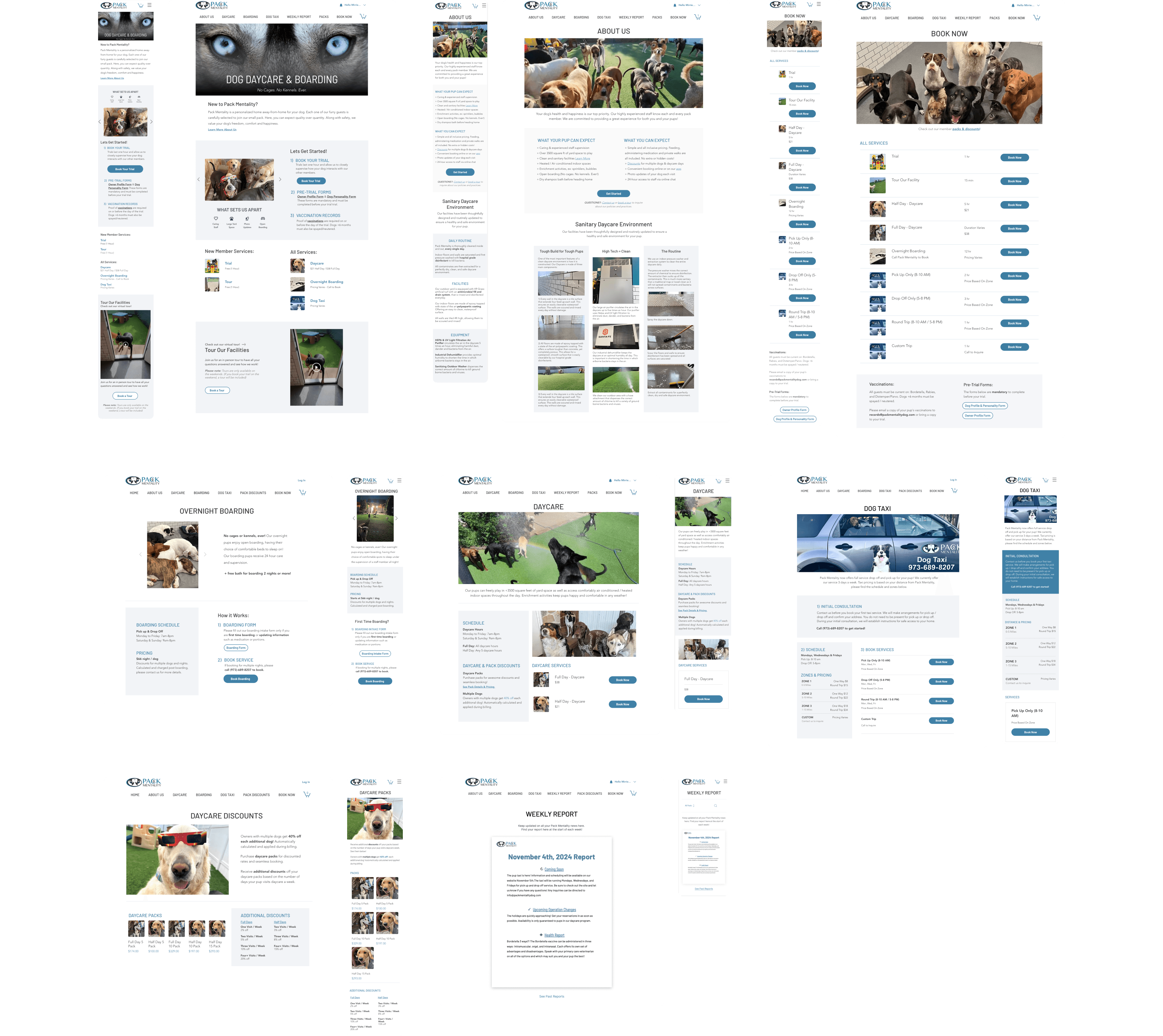
Final Responsive Designs
Metrics
+57%
New customers
16 in the month post design, 7 in the month prior to the redesign.
+13%
Site traffic, New visitors &
Order conversion
Indicates new visitors are converting to customers!
-11%
In offline sales (a good thing!)
The overall number of sales remained the same. Aka booked online rather than through the business owner.
Reflection
Main Takeaways:
People form habits from the very first time they use a product so it is important to test and design clear flows from the get go!
A marketing professional was hired a month after the redesign, leading to alterations on the website
I learned that as a designer, I will not have control over a product and it is a forever changing medium!
Next steps:
Several painpoints for the business owner and current customers could not be addressed because of WIXs' constraints
If the owner is open to it, I would love to create a website from scratch that would help solve those problems
In this scenario, I would conduct interviews with employees and customers to see how I could make tasks ideal for both parties


